Impacts to Additional Areas
View maps that show the potential impacts of the proposed 35% service reductions to additional areas of Allegheny County.
PRT has proposed reducing service by grouping and prioritizing routes into tiers. This tiered prioritization was created to reduce - to the fullest extent possible - harm in coverage, ridership, and equity.
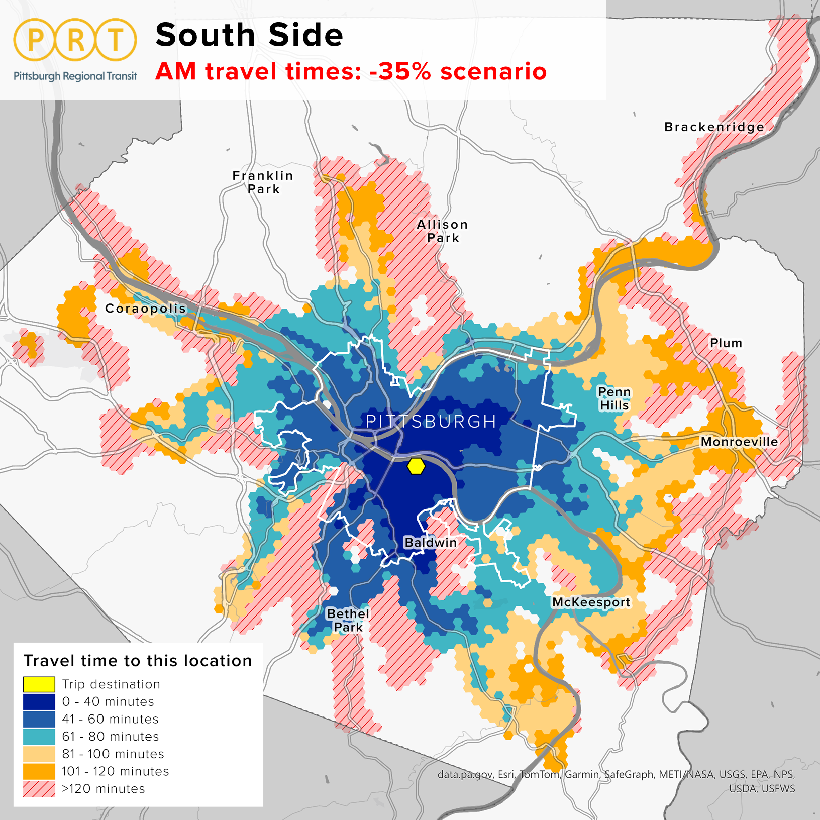
Comparing today’s transit service to a scenario with a 35% reduction reveals a troubling yet not unexpected shift in access: many neighborhoods within the City of Pittsburgh and the vast majority of communities throughout Allegheny County would face bus or light rail travel times exceeding 40 minutes to reach Downtown and Oakland. For many commuters, a transit trip that long becomes impractical, pushing more people into private vehicles. The result would likely be a surge in car traffic on already congested corridors like the Parkway East, Parkway West, Route 28, and Boulevard of the Allies. Local streets in neighborhoods such as Oakland, the Strip District, and the North Shore would feel the strain, too.
Streets and parking infrastructure in Downtown and Oakland are not built to absorb this sudden influx. With parking garages near capacity under current conditions, more drivers would mean longer searches for parking, increased double-parking and gridlock, and diminished air quality due to idling vehicles. The ripple effects could be felt across the region: longer commute times, less predictable travel for delivery and service vehicles, and a Downtown and Oakland that’s harder to access for workers, visitors, and businesses alike.
A 35% transit service cut wouldn’t just affect those who ride the bus or light rail, it would change how the entire region moves.
Use the slider below to see how morning travel times times would change with the proposed 35% service cut:


Use the slider below to see how morning travel times times would change with the proposed 35% service cut:


Use the slider below to see how morning travel times times would change with the proposed 35% service cut:


Use the slider below to see how morning travel times times would change with the proposed 35% service cut:


Use the slider below to see how morning travel times times would change with the proposed 35% service cut:


Use the slider below to see how morning travel times times would change with the proposed 35% service cut:


Use the slider below to see how morning travel times times would change with the proposed 35% service cut:

PRT uses the best available sidewalk data from the Southwestern Pennsylvania Commission (SPC) to estimate the areas that are within a quarter mile or 5 minute walk to transit -- the time that research shows most people find reasonable. The animation below shoes the areas that were within a 5 minute walk to transit in 2008 through today and highlights the losses the system and our region have experienced due to past budget cuts and what might come next if a 35% reduction in service results from a lack of state funding.

For a closer look at what might happen to transit access, browse the maps below which allow you to toggle between today's transit walkshed and what might happen if 35% of service is cut, what kinds of impacts different areas would see, and what communities would be most affected.
Use the slider below to compare PRT's current walkshed service area with the -35% service cut scenario.


Use the slider below to see the impacts of service cuts by type of impact. Service eliminated means no transit service would remain in that area, service reduced areas may see a reduction in the number of routes or the frequency of service or both, and no cuts areas would see no noticeable changes.

Click on the buttons to see which communities are more impacted by eliminated and reduced service. Hover your cursor over the circles to see how many residents are estimated to be impacted.
![]()


